NimbleBrain AIRedesigning the dashboard to speed up onboarding for new customers

Industry
AI B2B SaaS
Timeline
3 months
Year
2024
Team
CEO
2 Product Designers
1 Engineer
OverviewBusiness owners at growing companies struggled to complete onboarding without help.
Background
Built for medium-sized business owners, NimbleBrain connects tools like Google Drive, Slack, and Airtable into one place and makes them searchable with AI agents.
Project Overview
My role was to support stakeholders in reshaping the MVP as NimbleBrain shifted from a Slack-only chatbot to a full SaaS platform. Early users struggled with a dense interface and had trouble completing core tasks independently.
Business Impact
By redesigning key workflows and simplifying the interface, we improved usability, reduced support load, and sped up onboarding by 50%.
50%
Increase in users finishing onboarding independently
86%
Support requests dropped
62%
Redesign increased user confidence
ChallengeOnboarding was confusing, and business owners struggled to complete the setup on their own.
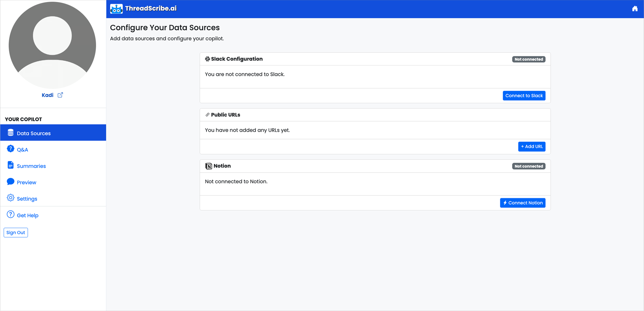
New users struggled to set up dashboards and leaned heavily on support, causing tickets to pile up and slowing growth.
With the new redesign, we turned confusion into confidence during onboarding.
Solution HighlightsClarity and Communication
Added alerts and error messages
Added loading indicators
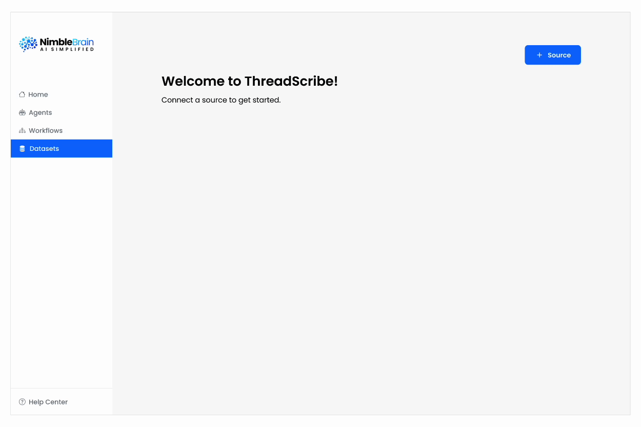
Guided Onboarding
Designed a step-by-step setup wizard for connecting tools
Consistency and Scale
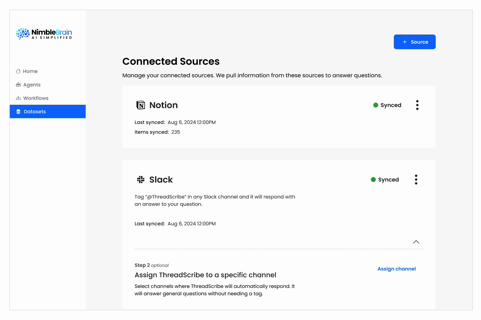
Standardized designs with resuable pattterns for scale
The Design Process - DiscoveryAligning on the why
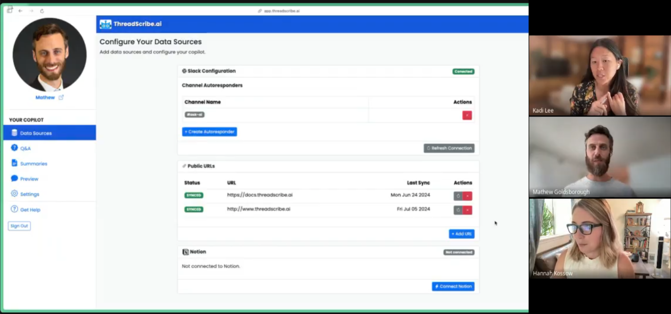
I led CEO sessions to align on purpose, vision, and goals before any research or design began.
Framing the problem
Early usability tests told a clear story:
Users felt confident starting onboarding and connecting tools, but many stalled before finishing, or reached out to support even after setup.
When things went wrong, they blamed themselves.
Minor stalls snowballed into major costs: shaken user trust, overloaded support, and engineers stuck on troubleshooting.
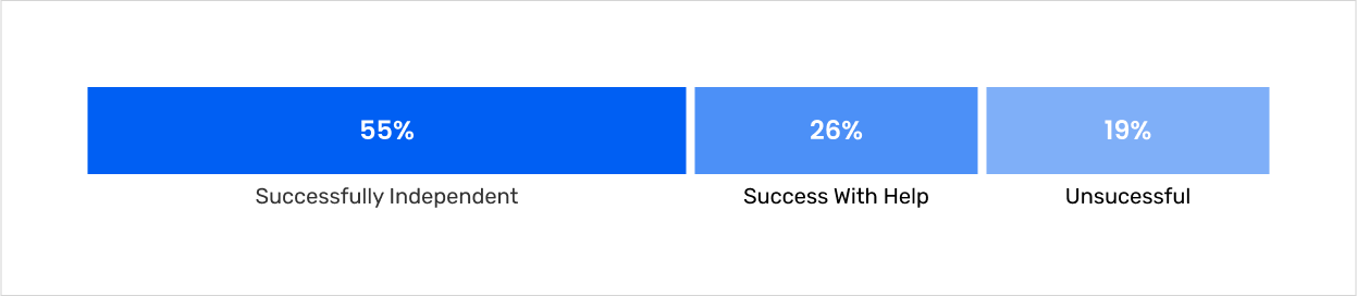
Tool connection success
Over a quarter of users could only finish setup with support, showing fragile confidence
Balancing constraints
User: Enable independent setup without constant support.
Business: Reduce support overhead to free up resources.
Technical: Work within existing API limits and Bootstrap components.
How might we give users clarity on what’s happening—and guide them to get full value from NimbleBrain?”
Created structure and consistency to the UI
I adapted Bootstrap’s Design Library into Figma to keep the product consistent and easy to update. By organizing components and setting up variables, I made the UI clearer for users and faster for the team to iterate on.
Organized Bootstrap elements in Figma so the team could reuse components and update the UI quickly.
Key Design Decisions
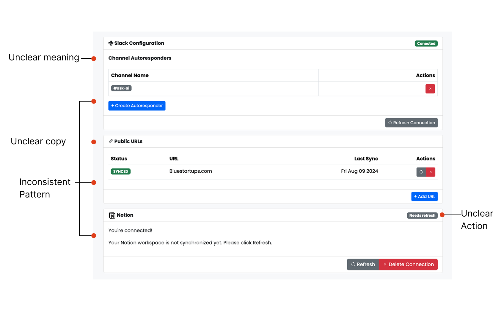
Before
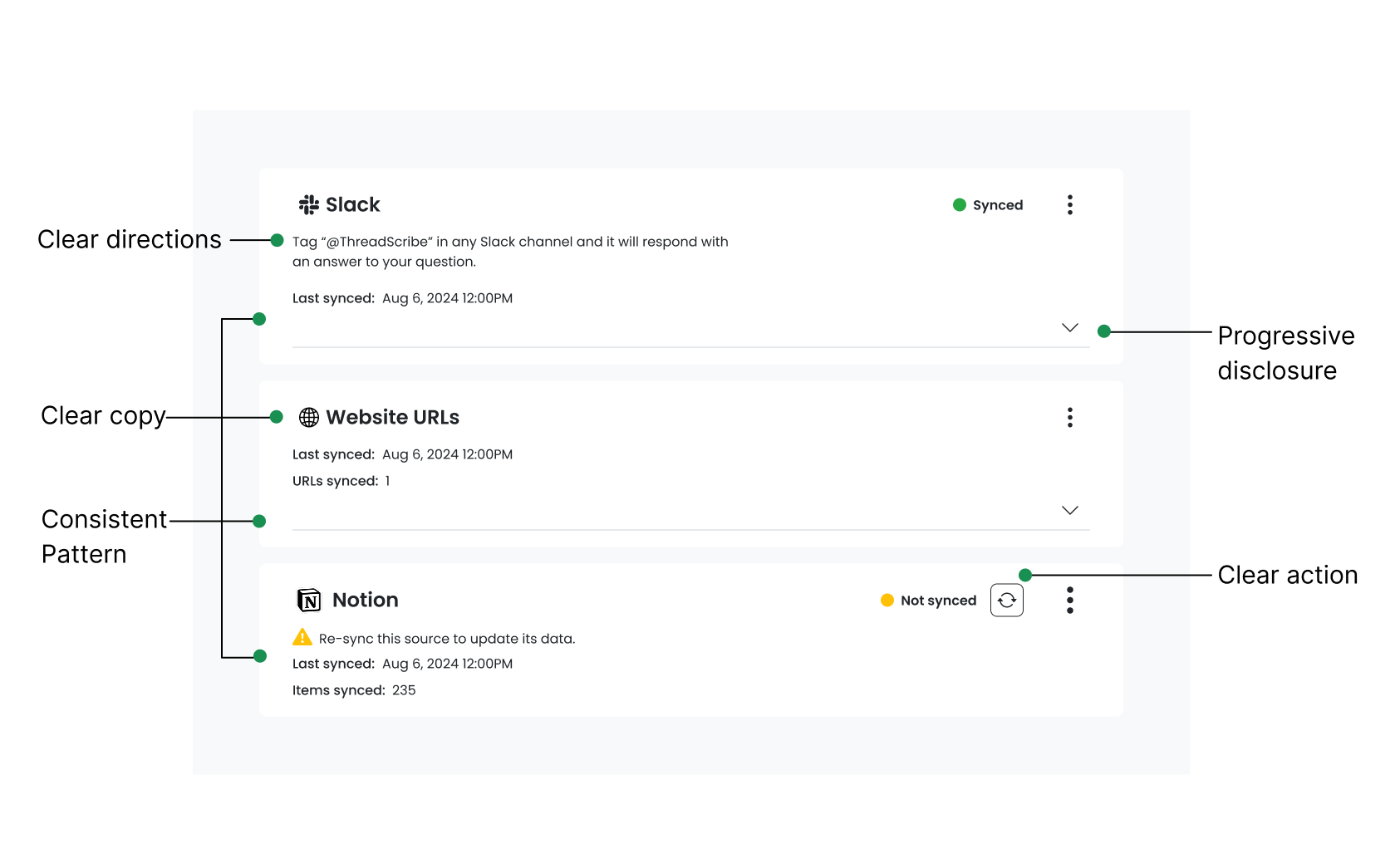
After
Business ImpactValidating the Impact
We did another round of usability testing, and the redesign showed measurable improvements. These outcomes demonstrated that the solution wasn’t only usable but also aligned with business growth and scalability.
50%
Increase in users finishing onboarding independently
86%
Support requests dropped
62%
Redesign increased user confidence
Reflections Balancing growth and usability
In a fast-paced startup, I adjusted my design approach to meet changing priorities while establishing a foundation for scalability. The most effective solutions weren’t flashy—they balanced user needs, technical feasibility, and business impact. By streamlining flows and clarifying feedback, I reduced support reliance and allowed the team to focus on growth.